How to Interpret a Research Figure
FREE ONLINE LEARNING MODULE
A figure holds your evidence.
Your reader needs you to explain it.
Learn a practical approach for moving beyond description, identifying meaningful patterns, building technically sound explanations and communicating why your results matter.
LEARNING OUTCOMES
What you will be able to do
Explain how strong interpretation improves clarity, technical insight, review outcomes, publication and citation.
Recognise common interpretation errors and understand why they weaken a research argument.
Apply a practical method to interpret a research figure systematically.
Interpret an unfamiliar figure in a concise, evidence-led discussion.
READY TO BEGIN?
Enrol free to unlock the course
Enter your name and email below. Your lessons remain locked until the form is completed successfully.
You will receive access immediately after enrolling.
ONLINE LEARNING MODULE
Interpreting Research Figures
Turn figures into clear, evidence-led arguments through a practical method you can apply to your own research.
WELCOME
What you will learn
Welcome to the module. This opening stage sets out the abilities you will develop and how each one supports your research writing.
By the end of the module, you will be able to:
- Explain how strong interpretation improves clarity, technical insight, review outcomes, publication and citation.
- Recognise the common errors in figure interpretation and understand why they happen.
- Apply a seven-step method, in order, to interpret a figure systematically.
- Distinguish the seven distinct moves: description, comparison, discussion, conclusion, insight, impact and implication, and support each with appropriate evidence.
- Interpret an unfamiliar figure in a concise, evidence-led discussion.
Work through the three lessons in turn, then apply the method to a worked example and see how the seven steps combine into a single piece of research writing.
LESSON 1
Why figure interpretation matters
Welcome to Lesson 1.
A figure holds your evidence, but evidence does not speak for itself. The reader depends on you to say what the figure means, why it behaves as it does, and why that matters. When you leave a figure to speak for itself, you leave your argument to chance, and readers rarely reach the conclusion you intended.
Strong interpretation provides four connected benefits. Select each card to explore how it strengthens your research writing.
A well-interpreted figure tells the reader exactly what to take from it. Without that guidance, readers construct their own reading, often a different one from yours, or none at all.
Interpretation is where understanding is demonstrated. Explaining why a figure behaves as it does, not merely that it does, shows that you understand the mechanism behind your own data.
A common criticism from examiners and reviewers is that results are presented but not discussed. Shallow interpretation can prompt major revisions or rejection even when the underlying work is sound.
Interpretation connects a result to the wider field and often reveals the next research question. It makes your result easier for others to understand, build upon and cite.
The rest of this module gives you a method for making that interpretation deliberate rather than accidental.
LESSON 2
Common interpretation errors
Welcome to Lesson 2.
Weak interpretation usually follows a small number of recognisable patterns. Review the seven recurring errors below to understand what each one looks like, why it weakens research writing and how to avoid it.
The seven recurring errors
- Stopping at description
- Over-claiming a cause
- Interpreting without the literature
- No clear aim to guide emphasis
- Using vague comparisons
- Selective reading and cherry-picking
- Over-interpreting a minor figure
Select each error to see why it weakens interpretation, when a similar approach may still be acceptable and how to improve it.
01Stopping at description.+
What is acceptable, and when it becomes an error: One or two descriptive sentences can orientate the reader. Description that is never followed by explanation, judgement or significance is shallow interpretation.
02Over-claiming a cause.+
What is acceptable, and when it becomes an error: A cause you measured, or that theory directly supports, may be stated plainly. An inferred cause must be hedged with words such as “may,” “could” or “is consistent with,” and its evidential limit should be stated.
03Interpreting without the literature.+
What is acceptable, and when it becomes an error: You do not need to cite exhaustively, but a figure that answers a research question should be placed against directly relevant prior work.
04No clear aim to guide emphasis.+
What is acceptable, and when it becomes an error: Completeness is not the goal; relevance is. The aim determines which trends and anomalies deserve attention and which can be passed over.
05Using vague comparisons.+
What is acceptable, and when it becomes an error: Qualitative comparison is acceptable only where values genuinely cannot be extracted. Wherever the data permit, use values, percentages or ratios.
06Selective reading and cherry-picking.+
What is acceptable, and when it becomes an error: You may focus on trends relevant to your aim, but you must not omit contradictory evidence that a fair reading would have to address.
07Over-interpreting a minor figure.+
What is acceptable, and when it becomes an error: Match the depth of discussion to the figure’s importance. Give it enough attention to make its point, but not so much that it buries the findings that matter.
These errors share one root cause: interpretation treated as intuition rather than as a deliberate process. The next lesson gives you that process.
LESSON 3
The seven-step method
Welcome to Lesson 3.
Interpretation becomes reliable when you treat it as an ordered reasoning process rather than a matter of instinct. The seven steps move from evidence to consequence, from what is on the page to what it means for the world. Follow them in order because each step builds on the one before.
Explore each card in order. The front names the move; the reverse explains what to do. The numbering and path keep the recommended sequence clear.
Describe
State the variables, axes, units, groups, test conditions and controls. Orientate the reader to what is plotted before you interpret it.
Select again to returnCompare
Identify and quantify trends, maxima, minima, differences, outliers and crossovers within the figure. Then compare against relevant literature. Is your result consistent with previous findings, or does it differ? This external comparison turns a local observation into a contribution.
Select again to returnDiscuss
Explain why the behaviour may have occurred, drawing on theory, previous studies and experimental conditions, without claiming a cause the figure cannot demonstrate.
Select again to returnConclude
State the principal judgement the figure supports. A conclusion is a decision about what the data show, not a restatement of the description.
Select again to returnInsight
Express the transferable technical lesson that reaches beyond this particular observation, the principle that holds in other cases.
Select again to returnImpact
Explain why the finding matters for practice, design, modelling or further research.
Select again to returnImplication
State what follows from the finding, especially the risk if it is ignored.
Select again to returnWORKED EXAMPLE
Applying the seven-step method to a research figure
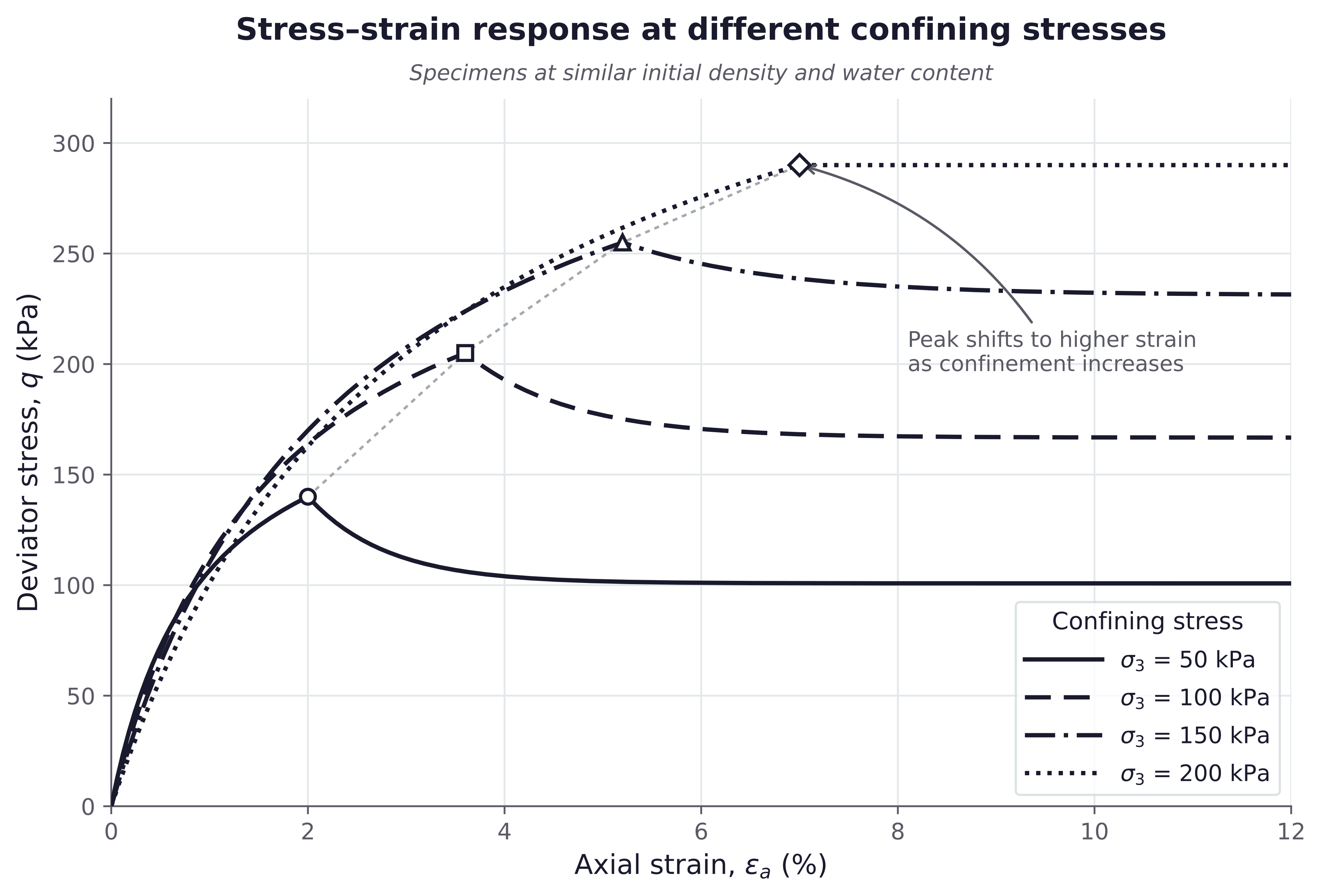
Now apply the seven steps to the figure. This example uses illustrative geotechnical data and a hypothetical comparison study for teaching purposes.
Select each step to reveal how the interpretation is built.
1Describe+
The figure presents deviator stress against axial strain at confining stresses of 50, 100, 150 and 200 kPa. All specimens were prepared under similar test conditions.
2Compare+
Peak deviator stress occurs at roughly 2% axial strain at 50 kPa, rising to roughly 7% at 200 kPa. Suppose, for illustration, that a comparable published study reported a higher peak reached at a lower strain. Your result therefore differs from the literature, and that difference is what the discussion must address.
3Discuss+
Two things need explaining: the trend within your data and the difference from the comparison study. Higher confinement restricts lateral deformation and may delay failure, producing more ductile behaviour and shifting the peak to higher strain. The difference from the published study is less certain. Sampling location, mineralogy, chemical composition or test procedure could contribute. These are candidates for investigation, not proven causes, and each would need to be tested.
4Conclude+
Confining stress influences both the mobilised deviator stress and the axial strain at peak. Where a result differs from the literature, possible reasons should be identified and, where feasible, tested rather than assumed.
5Insight+
Peak strength should not be read in isolation from the strain at which it occurs. An apparent disagreement with previous work is a prompt to examine what differs between the studies, not simply to report the discrepancy.
6Impact+
Test programmes should represent the field confinement of interest and record conditions that might explain differences between studies, including sampling location and specimen composition, so later comparisons can be interpreted properly.
7Implication+
Ignoring confinement, or dismissing a disagreement with the literature without investigating its cause, may lead to unsuitable design parameters and inaccurate deformation or settlement predictions.
PUTTING IT TOGETHER
A complete discussion
In a thesis or paper, you do not write seven labelled paragraphs. The steps are a thinking tool. In the final text, they combine into a single coherent argument.
Figure X presents deviator stress against axial strain under different confining stresses. Lower confinement reaches peak deviator stress at relatively low axial strain, around 2% at 50 kPa, while increasing confinement shifts the peak towards larger strains, around 7% at 200 kPa. This behaviour may be associated with restricted lateral deformation under higher confinement, which delays failure and allows greater deformation before the peak. This result differs from the higher peak at lower strain reported in the comparison study. That difference could stem from sampling location, mineralogy, chemical composition or test procedure, which would need to be tested before any could be confirmed. The results indicate that confinement, and the conditions that distinguish one study from another, should be considered together when selecting design parameters. Otherwise, deformation and serviceability predictions may prove inaccurate.
Notice how the final paragraph moves from observation to comparison, explanation, judgement and consequence without displaying the method as a checklist. The structure remains present, but the writing reads as one connected research argument.
ASSESSMENT
Interpret an unfamiliar figure
Study the chart, plan your response and write a connected research discussion rather than seven disconnected answers.
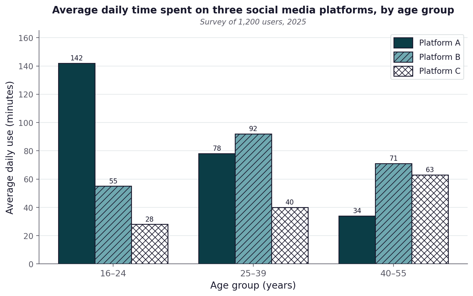
Task: Write a 400 to 500-word interpretation.
- Describe the quantity, units, platforms, age groups and survey source.
- Compare all three patterns and quantify at least one difference.
- Distinguish the decline, rise and middle-age peak.
- Discuss a plausible reason using cautious language.
- State a clear conclusion.
- Add a supported insight, impact or implication.
Type your answer
Word count: 0
Please enter your interpretation before submitting.
Marking criteria
- Describe accurately: 20
- Compare and quantify: 20
- Distinguish patterns: 18
- Discuss cautiously: 15
- Conclude: 15
- Add insight, impact or implication: 12
Pass mark: 60%
RESULT
Your assessment result
RUBRIC RESULT
0% · Not yet marked
- Submit your answer to receive criterion-level comments.
Complete the assessment to finish
Your result and next step will appear here.
COURSE FEEDBACK
How was your learning experience?
Select a rating, then add a short review if you would like to tell us what worked well or what could be improved.
Your course journey is now complete.